Make your twitter cards look nicer
March 26, 2020
Today I remembered that I made a change recently to how Twitter cards are rendered when I share a link on cassey.dev, but did not make the same tweak on cassey-til.glitch.me.
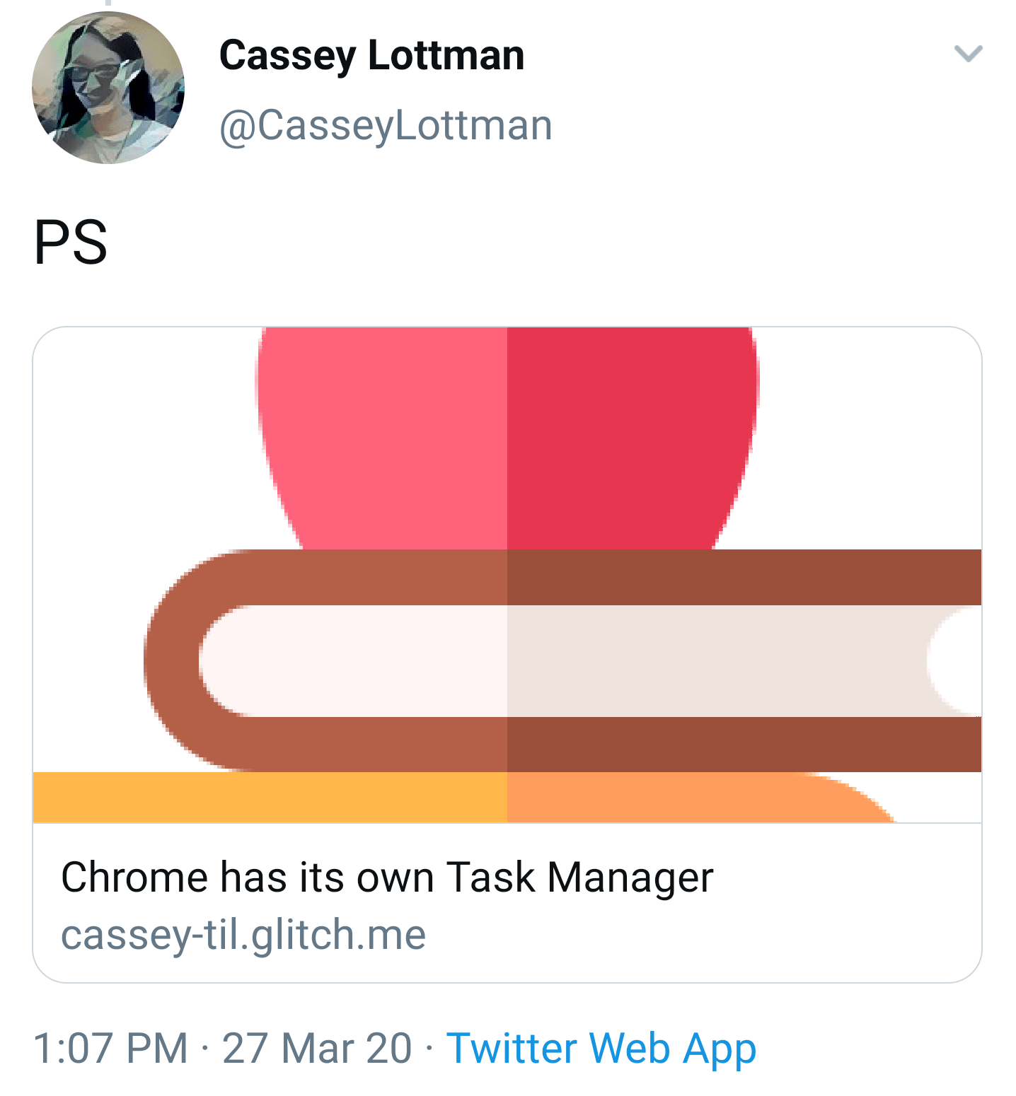
Before, when I shared posts from cassey-til.glitch.me on twitter, the card looked like this:
That was because I had a meta tag on my page like this:
<meta property="twitter:card" content="summary_large_image">The meta tag should use summary as the value instead since my social sharing image is square. Like this:
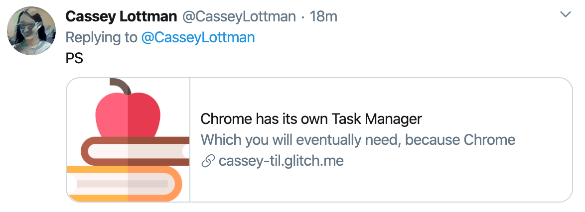
<meta property="twitter:card" content="summary">Now my tweets look like this when I share a link:
See Twitter docs about Summary With Large Image vs docs about the Summary card.