What Do You Mean It Looks Gen-Z? A Journey
August 29, 2024
Hello. Let me take you on the journey I went on tonight, because I had a can of caffeinated soda this evening which I really know I should never do, because now I will be wide awake until far too late, when usually I would be hours asleep by this time.
The journey begins earlier this evening (after the soda, but before the rest) when I saw a new post from Bess Kalb, called "Passive Aggressive Emails with my Baby about Bedtime". It reminded me of a piece I'd seen recently and laughed muchly at, "Passive Aggressive Work Emails With My Toddler About Dinner", and lo, it was the same author, back with more! Thus began a dive into Bess's substack archive, which contained many a wholesome chuckle, and eventually landed me on her excellent gift concierge posts from a few years back, and I always do love a good gift guide. She mentions many quirky (and pricy) online storefronts I've never heard of, so naturally, I clicked.
And this is where the story starts getting interesting, though it was already a pretty good night, what with the comedy writing and all. This is the point where I opened up the tab for a brand called Dusen Dusen, which I believe had made some funky slippers that were linked in one of the gift guides. And I was scrolling down the site, a bit intrigued at the maximalist design and color schemes, and a bit horrified as well, because it's not quite maximalist and boldly colored in my own preferred color scheme/maximalist aesthetic. I said to my partner, "dang, this site is so Gen Z!" and my partner, who is very online and aware of some aspects of Gen Z culture, but not online or Gen-Z-aware in exactly the same (limited, particularly as far as being aware of Gen Z) ways I am, said "wait, what do you mean by that?"
This question lead to much consternation. I meant a very specific thing by that! But... what, exactly, was it? I felt very frustrated at not being able to immediately articulate what I meant.
I pulled up the Consumer Aesthetics Research Institute's "Index of Aesthetics" from my bookmarks, but it is unfortunately still rather limited on aesthetic consumer trends of the 2020s. (It's fun to browse though, so open that new tab and come back.)
The Fandom Aesthetics Wiki had many more category descriptors assigned as relevant to the 2020s - more to wade through, but I determined pretty quickly that none of the categories they listed were exactly what I had in my head.
Hmm!
Eventually, through a series of searches probably with words like "gen Z pastel colors" or "gen z squiggles aesthetic", I came to learn of the term "avant basic" as a name for basically what I had been imagining - a couple very specific shades of a few different colors, and certain motifs like squiggles, checkerboard (alternately, squiggly/wavy checkerboard), cow print patterns, etc.
The articles I found describing the trend seemed to first appear around 2021 or so. Mostly they described the avant basic color palette as "bright", "bold", and "pastel". This frustrated me though, because the images accompanying each page, and the images in my head of things I'd seen that matched the aesthetic, were not just any bright, bold colors, or any old pastels. But, I felt like my color vocabulary was sorely lacking at being able to describe what sets those specific shades apart. What makes something avant basic? How do I recognize specific color palettes or patterns as being trendy "Gen Z colors" (at least to my trendspotting eyes, which are admittedly, probably not calibrated the same as yours or almost certainly, of any actual Gen Z person's!)? What makes those colors/patterns distinct from the bold, maximalist colors and patterns that appeal to me specifically?
My research took me to this reddit post showing an apartment styled in avant basic in the Sims 4 video game, which was a pretty handy reference for many of the common components of avant basic. We've got the wavy outline of the pastel green headboard, lots of rounded edges, a rounded geometric or cartoon-blobby side table, the pink cow print rug -- all in just the bedroom. In the next photos we see a checkerboard rug, a wavy S-shaped candle on a cloud shaped floating wall shelf, and just lots more wavy-edged furniture, and a color palette made of particular shades of purple, pink, light green, and yellow.
I read this late 2021 post in Architectural Digest on avant basic, which has some great exemplar photos showing furniture designed by Sophie Collé. I also read a guide to the trend by a site called Clothes and Water, which has great pictures attached of clothing items (for sale in 2021, presumably) that typify the trend or are ways to indulge in it in a more restrained way. (The header image, with the purple checked jumpsuit and the cropped green checkered sweater with patterned pants, definitely feels the most clearly of the trend I had in my head.)
Architectural Digest claims the trend has roots in Memphis Design in the 1980s, while the Clothes and Water page points to the lineage of psychedelic '60s and bold floral/geometric '70s patterns. I could see a mix of all three serving as inspiration for the kinds of patterns and color schemes I'm seeing now. (Or perhaps.. beginning maybe in 2021? And over the last few years any time I've stepped into anything similar to an Urban Outfitters...)
Around this point I clicked over to Etsy, which I expected to have many things to show me for the search results for "avant basic". However, here I mostly struck out. While Etsy did return many results for my query, mostly the first page or two of results were things like black tunics and dresses, plain silver jewelry, etc. I'm not really sure what happened there honestly; it seems somewhat surprising to me that none of the sellers on Etsy are labeling their goods as avant basic when they actually are, and I've come to expect Etsy listings to be jam packed with possibly-relevant SEO keywords, whether the item is produced by an actual small-time handcrafting artisan or passed-through factory overstock from a dropshipper. My conclusion was that this unexpected search experience was simple evidence that the Etsy that once was, is with us no more, perhaps in more ways than I expected. (My expectation being: dropshippers galore, whose paid ad placements in search results bump the actual artisans, who maybe left the platform anyways due to higher and higher fees, further and further down.)
I got caught however by the gift guide pages that Etsy wanted me to click on (have I mentioned I'm a sucker for gift guides? After all, that's how we got here...). At one point Etsy suggested under "gifts for a maximalist" that I consider "minimalist gifts" which I am not sure if was intended as an ironic choice? Or maybe they are hoping to catch people who cannot remember which concept goes with which word, which, fair I suppose, I bet that indeed sometimes works.
I was talking through my explorations up to this point on Discord, and a friend had mentioned that the reference images I was showing just felt pretty generically 90s. But no, I insisted, it's different, I just can't explain how yet!
Etsy, it turned out had a section of gift guides for "90s vintage accessories", which turned out to be quite useful in helping me articulate the differences!
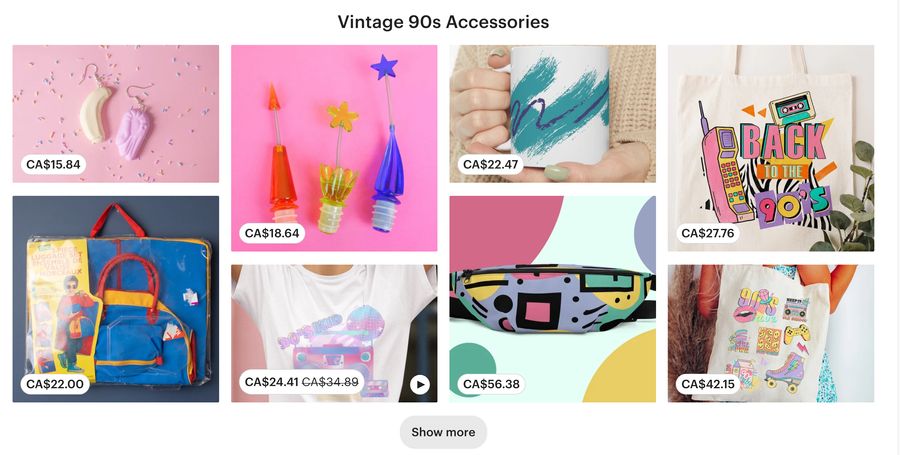
I noticed in the so-called "90s vintage" items that some similar colors appeared -- the same pastel purple, occasionally a similar light yellow. But the way that the colors were used was pretty different. In avant basic, interior design or even a single item of furniture might use many of the colors from the palette, but in much greater isolation-- one color per object like the green headboard, purple table, pink lamp. Or if the colors are mixed in the same object, like in Sophie Collé's furniture, it was color blocked: one piece of wood in this color, connected to another piece in a different color. In avant basic, two-toned items like checkered or cow print patterns, the pastel shade is generally paired with a neutral, not a contrasting color. In the 90s roller blade on the tee shirt Etsy wants me to buy, the purple shoe is right there with the yellow and blue lightning bolt, attached to the pink laces and the yellow wheels. Avant basic would never!! But other 90s-inspired designs might.
The belt bag reminded me a bit of patterns I've seen on Mokoyubi.com, so next I opened up that site. Mokoyubi does a lot of bold colors and prints-- really different ones though, colors especially, than typify avant basic.
In this very expensive quilted jacket, for example, the background of the fabric is two shades of purple (or a purple and a blue, your call) in a wavy pattern, with white smiley faces overlaid in the foreground of the fabric. Smiley face motifs feel very Gen Z (and also, perhaps, 90s!) but this is a different way of doing something 90s-inspired in bold colors than precisely what we've seen so far this evening.
Then there's the colorblock stuff like these backpacks. Bold colors!! But not bold in the same shades as the other shades we've been looking at. I wish I had the color vocabulary or awareness to be able to say what makes the colors in this collection different than the avant basic colors.
So, at this point in the night's journey to articulate design trends to myself/my partner, I was feeling good. I felt like I had really clarified my thinking on what I actually meant when I said offhand, "this site feels very Gen Z". I had identified the particular color shades and recurring design motifs I had a vague sense of, and I even had a name: avant basic, which I knew drew on many sources of inspiration, including Memphis (or Memphis-Milano, as cari calls it), and 60s/70s/and maybe just generally 90s stuff.
My partner, who had been blissfully playing a video game for the last hour or so at this point, then looks up. "What's wrong?" she says. "You seem stressed."
Well, what had happened was I went back to one of my original open tabs, the Dusen Dusen online store. Go ahead, open it up again yourself, I'll wait here.
You see the problem?
This isn't avant basic at all!!
I can see that there are some overlapping precursor influences perhaps - and indeed, MyModernMet lists Dusen Dusen as a modern brand that's inspired by Memphis design.
But when I go back to Dusen Dusen's site, I see that the color palette is actually pretty different: more saturated hues, perhaps? Less pastel, more what I myself might properly consider "bold". The motifs are distinct, too. Wide color block stripes, but bold colors are striped right next to each other, not paired solely with a neutral. Still some waves, and some checkers, but more complicated in design than the examples we were seeing earlier. (Maybe this is just what happens when your recollection of a trend is of essentially what was trendy in 2021, and it is now 2024? Who's to say...)
Anyways, I hope you enjoyed coming with me on this little journey I went on. I guess I will try to sleep now, and um, recommit in the future to my usual standard of "you absolutely cannot drink a caffeinated beverage after 5pm, you absolute fool". So that's one thing we learned tonight for sure, except we already actually supposedly knew that... but also, I feel like this was a really interesting learning exercise for me about design and visual art, and I feel good about that part!
I've been wanting to get better at visual & graphic design, and am slowly working towards that. One of the things I learned in an early lesson of The Art of Visual Design is that on the way to becoming a better designer, one of the important skills is being able to simply talk about a design - to notice the component elements, and to be able to use words to describe what you are seeing. It's hard to effectively critique a design (your own or others') if you can't describe what you're even looking at! So, it was cool tonight that I stumbled into my own little practice session for this skill.